Bob Rides App
Design System & Critical Flows
Overview
Bob is an Indian ride aggregator that allows users to compare and book rides across platforms like Uber, Ola, Rapido, and Namma Yatri in one place.
The product gained strong early traction. Users understood the value immediately.
But once real usage kicked in, the cracks started to show.
What Was Going Wrong
1. Critical flows failing
Users couldn’t log in (OTP failures)
Completed rides not appearing in activity
Missing or incomplete price comparisons
Price inconsistencies across platforms
2. Lack of a System for UI
Inconsistent typography & spacing
Non-scalable color usage
Broken layouts
The Challenge
It wasn’t just one bug or UX issue.
We were dealing with:
A product actively breaking in key moments
An interface that wasn’t built to scale.
Both needed to be addressed immediately.
Ratings dropped from 4.3 → 3.2
50+ negative reviews accumulated
Investors began questioning product reliability
Felt like a college project, not a reliable product.
Waiting to “fix everything later” would have meant continued user loss.
Fixing the Highest-Impact Failures
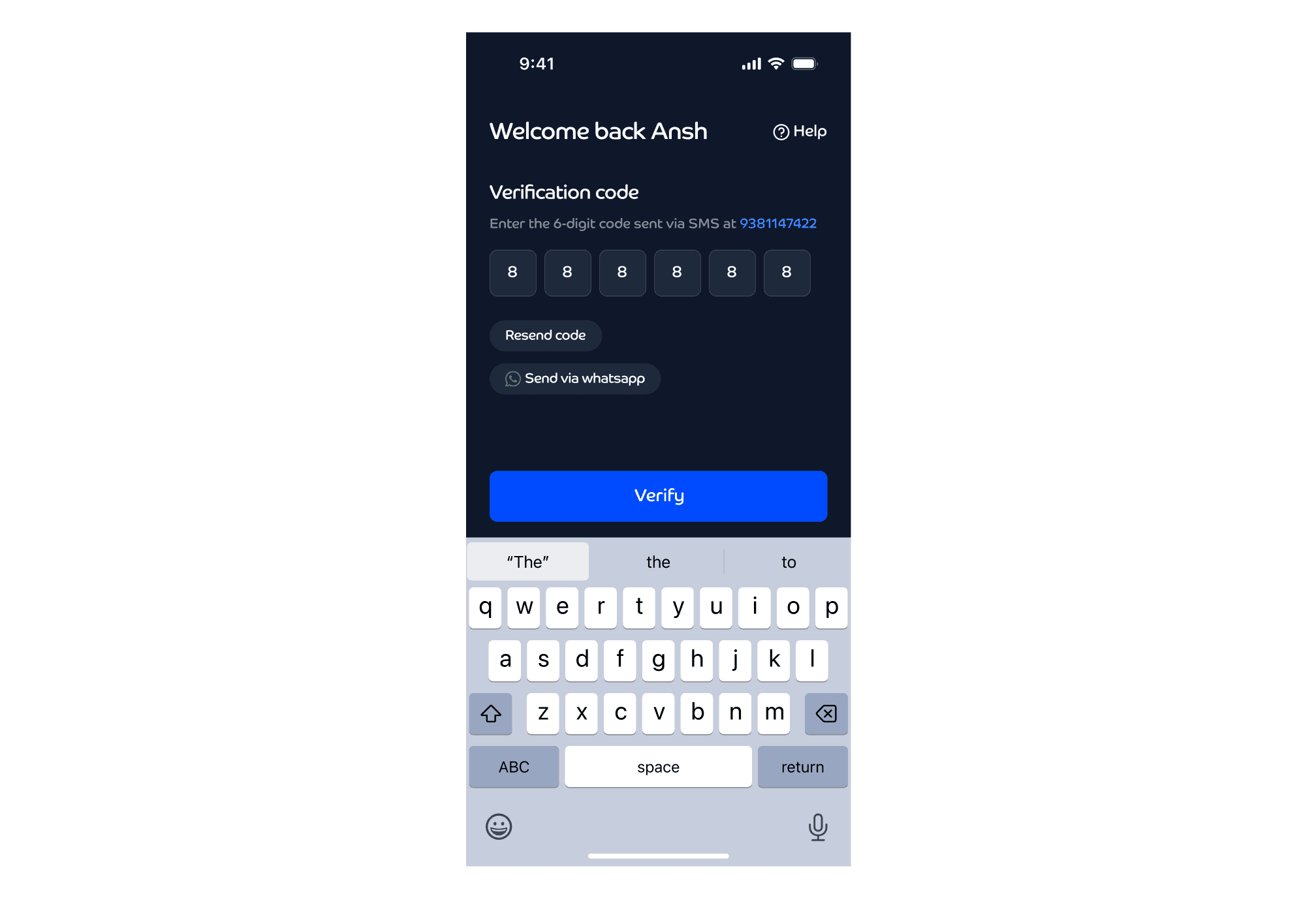
The OTP Crisis
One afternoon, downloads flatlined. We checked the Play Store. Multiple new reviews appeared, all saying the same thing:
“I never received the OTP.”
Why?
Our OTP provider had failed and our users had no help or recovery path.
Impact:
~2,000+ users lost in a day
~5,000+ total drop due to OTP
Downloads flatlined
If users couldn’t log in, nothing else in the product mattered.
What We Changed
Added help button on OTP screen
Introduced fallback OTP systems (SMS + WhatsApp)
Built self-diagnosis flow (top 3 failure causes)
Created escalation path for unresolved cases
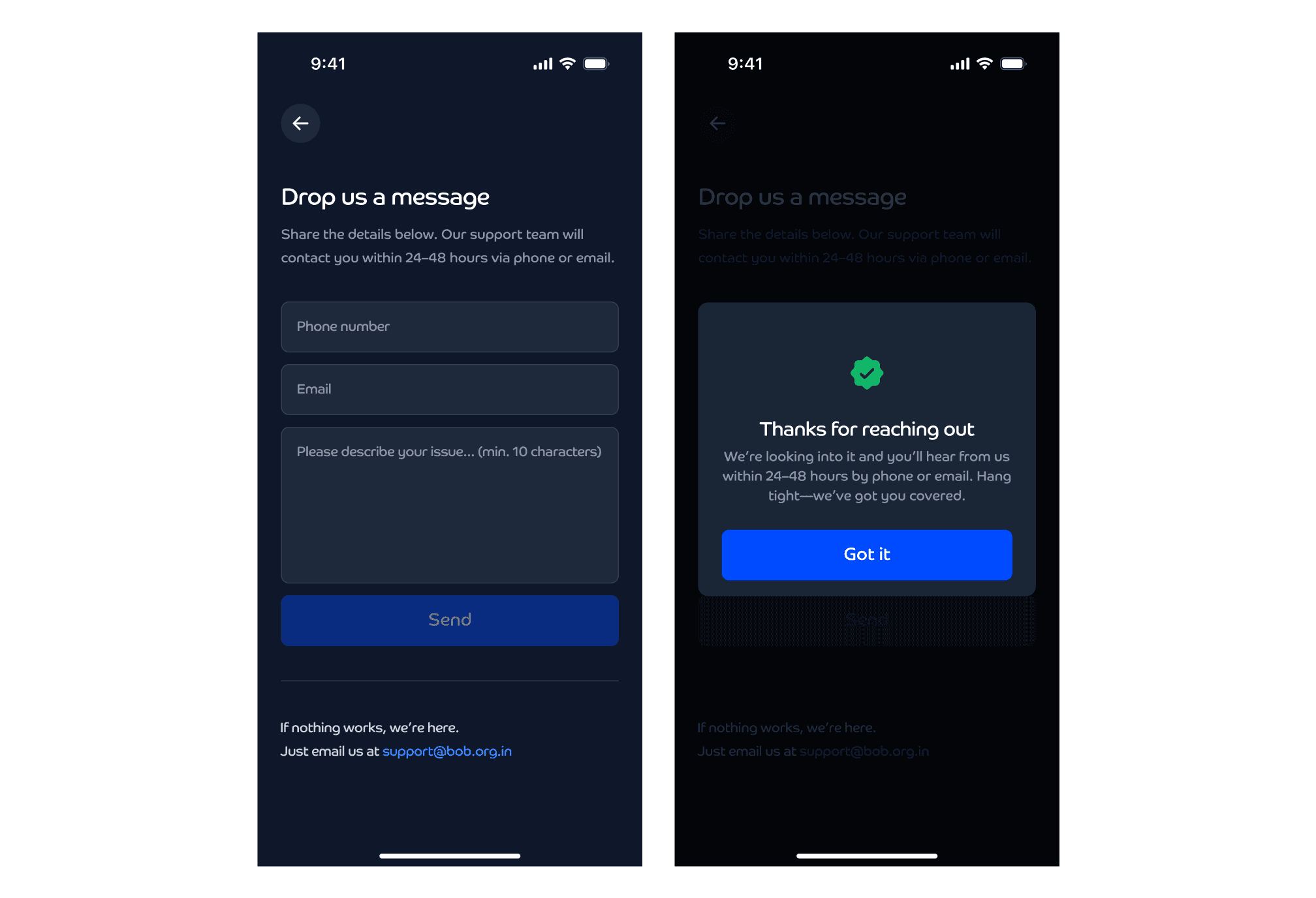
Outcome
OTP complaints → 0
Downloads stabilized
Users could complete onboarding seamlessly
While addressing many other critical issues like this one, a deeper problem became clear.
The interface itself was contributing to user distrust, and that is where the design system came in.
Rebuilding Foundation: Design System
The UI itself was breaking trust with users as well as investors. We saw issues like:
Poor readability
Inconsistent headers
Unscalable colors
Layout issues
Spacing and responsiveness were inconsistent
The Approach
Our approach was inspired by Brad Frost’s Atomic Design.
This wasn’t a clean, linear rollout. We had to balance:
Long-term system building
Immediate perception improvement
So the work progressed in parallel:
I focused on building a complete, scalable light mode system
The other designer worked on a faster dark mode refresh using emerging patterns
This allowed us to:
respond to investor pressure quickly
continue building a long-term foundation
1. Interface Audit
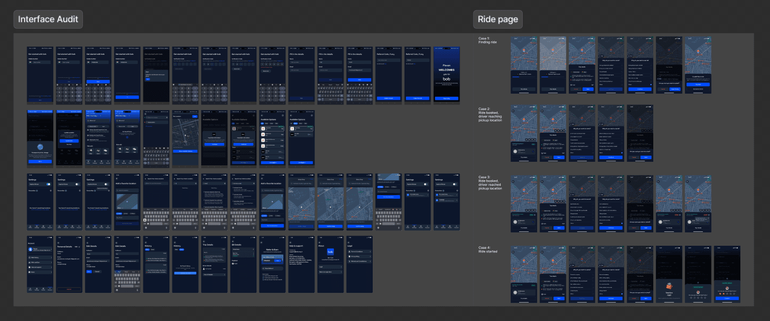
Documented every UI element across the app
Identified inconsistencies and missing states
Mapped friction points
2. Atomic Deconstruction
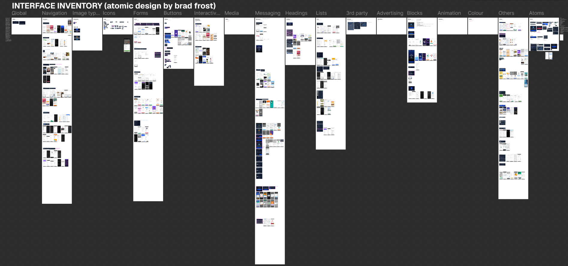
Broke the UI into smallest units: buttons, inputs, forms, bottom sheets
Benchmarked each against industry standards
3. Variable Setup
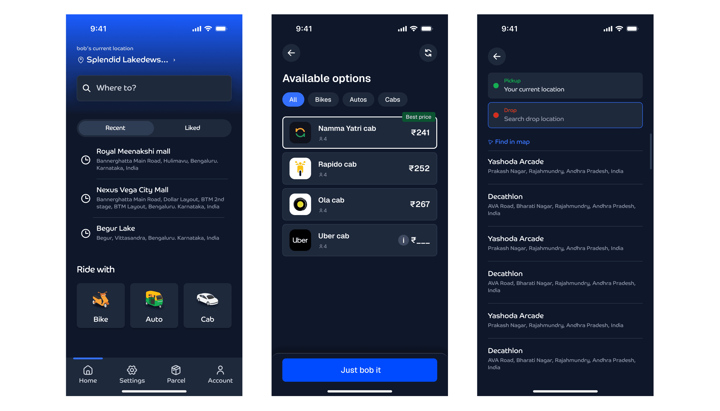
4. Component Library
Built standardized components
Defined behavior across all states
Enabled consistency across screens
5. Guerrilla Testing
Tested new designs with real users
Identified usability issues quickly, such as: pure black background felt too harsh, so shifted to a softer dark tone which improved the design significantly.
6. Implementation
Worked closely with developers
Ensured consistent execution across screens
Focused on responsiveness and scalability
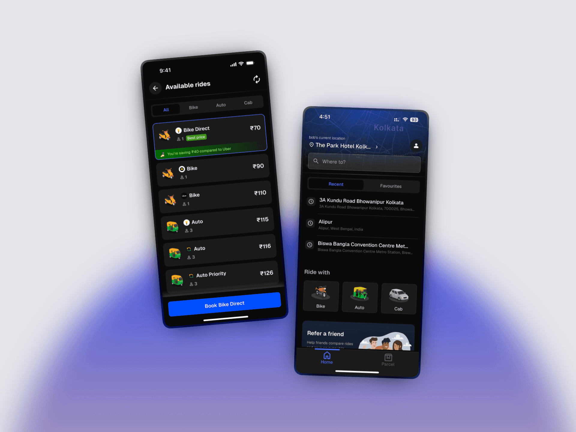
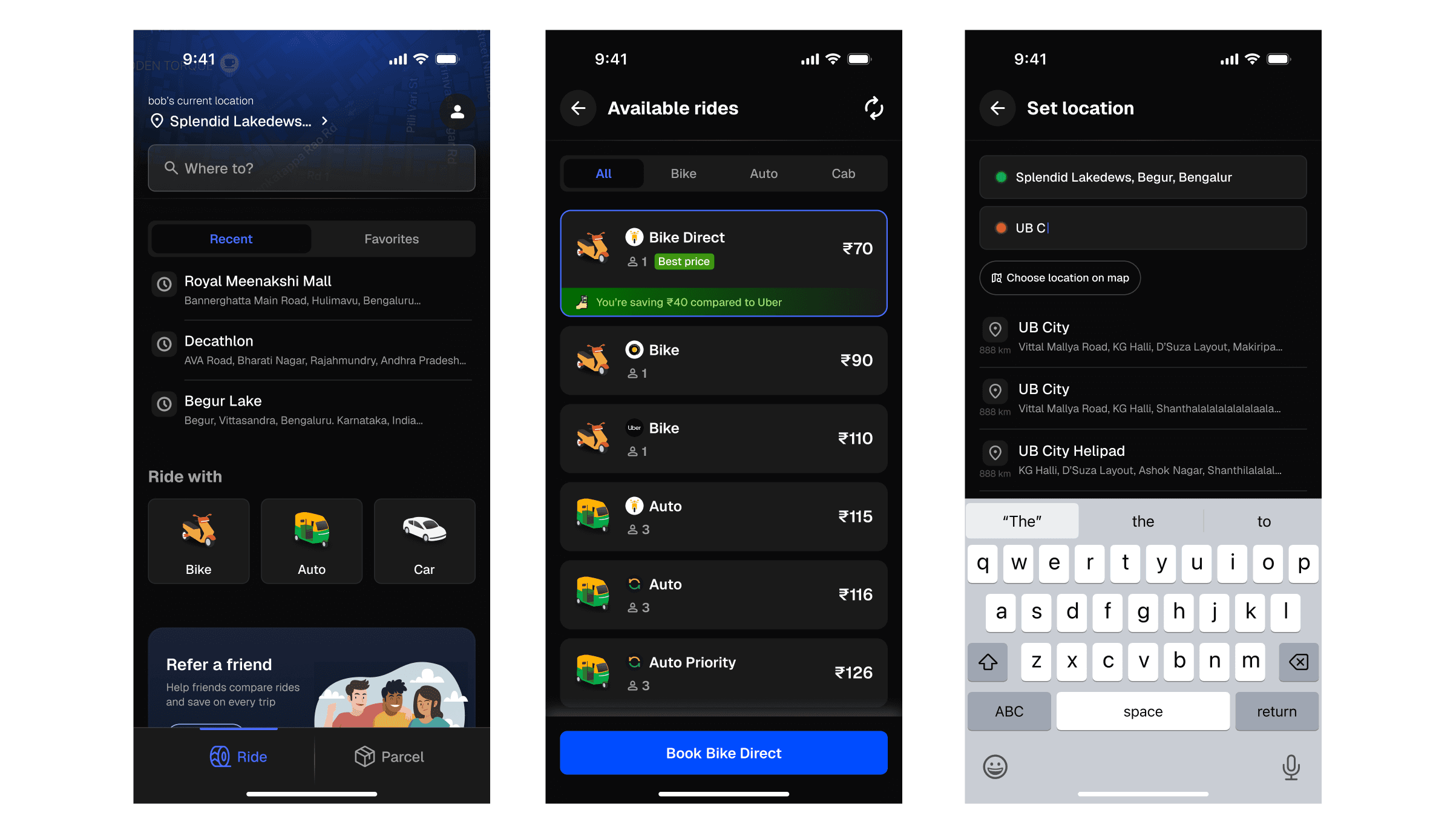
BEFORE 👇
AFTER (Dark Mode) 👇
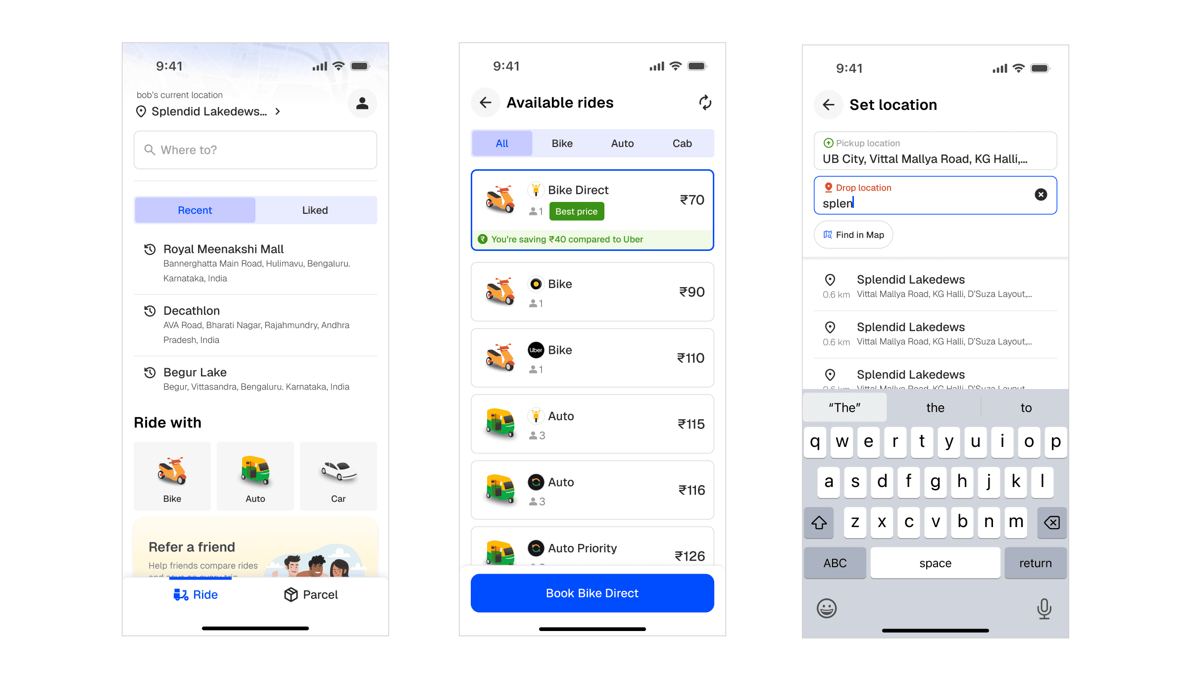
AFTER (Light Mode) 👇
Impact
+24% Daily Active Users
~82% reduction in user loss
Bounce rate decreased 40% to 18%
70% faster dev speed
Improved investor confidence
Key Takeaway
Fixing what’s breaking and building for scale can’t be sequential.
Both have to happen together, or the product doesn’t survive long enough to improve.
Project Links
Figma Design File:


